Select Page


PROGRAM AREAS
Click “More” to find projects and related activities for each Program Area.

Smart
Transformation Supporting digital transformation and other technologies associated with Industry 4.0 to create opportunities for increased productivity in all sectors and enterprises of different sizes.

Quality of the
Workforce Improving the productive capacity of the orkforce by building future-fit knowledge, skills, and attitudes.

Green
Productivity Enhancing productivity while reducing the environmental impact of economic activities through the application of appropriate tools, techniques, and technologies.

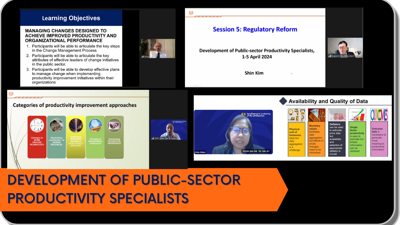
Robust Ecosystem & Regulatory Framework Promoting an enabling regulatory environment and conditions for innovation to flourish.

Innovation
CapabilityFacilitating a country’s ability to produce and exploit new products, services, systems, and processes.

SME
Development Enhancing the productivity of MSMEs and the informal sector.

Broad-based
Engagement Enabling widespread participation in and commitment to the productivity movement focusing on women and persons with disabilities.

Productivity
GainsharingPromoting concepts and practices leading to the equitable distribution and sharing of the results of productivity gains.
NATIONAL PRODUCTIVITY ORGANIZATIONS


Latest Publications