Select Page
The Asian Productivity Organization (APO) is an intergovernmental organization established in 1961 to increase productivity in the Asia-Pacific region through mutual cooperation. The APO contributes to the sustainable socioeconomic development of the region through policy advisory services, acting as a think tank, and undertaking smart initiatives in the industry, agriculture, service, and public sectors.
The APO is shaping the future of the region by assisting member economies in formulating national strategies for enhanced productivity and through a range of institutional capacity-building efforts, including research and centers of excellence in members. It is nonpolitical, nonprofit, and nondiscriminatory.
The current membership is 21 economies, comprising Bangladesh, Cambodia, the Republic of China, Fiji, Hong Kong, India, Indonesia, the Islamic Republic of Iran, Japan, the Republic of Korea, Lao PDR, Malaysia, Mongolia, Nepal, Pakistan, the Philippines, Singapore, Sri Lanka, Thailand, Turkiye, and Vietnam.
Click for the APO Members.

Contribute to the sustainable socioeconomic development of Asia and the Pacific through enhancing productivity

Inclusive, innovation-led productivity growth in the Asia-Pacific

Sustained productivity growth
Robust innovation ecosystem
Inclusive engagement and shared prosperity

The APO’s scope of support for its members covers both industry and agriculture, the two most important production sectors of member economies. The official logo of the APO is a montage of two icons: a gear, typically used to depict industry; and grains on stalks, representing agriculture. The abbreviation “APO” appears at the base, denoting the organization’s role as the connecting entity.

The GBM logo uses the common element of a gear and grains on a stalk to create a human figure leaping forward. This demonstrates the desire of the Governing Body and impact of collective decisions to lead member economies in the journey to improve their socioeconomic status. The logo is identified by the label “GBM.” The session number, date, and venue, however, change each year. The logo uses APO orange and blue to maintain brand identity.

The WSM logo is derived from the APO logo and uses the common element of a gear and grains on a stalk to encircle human figures depicting a roundtable meeting. The logo is clearly identifiable by the label “WSM.” The session number, date, and venue, however, change each year. The two colors are the standard APO orange and blue to maintain and project the APO’s organizational theme.

The APO-AB identifies and certifies organizations that offer productivity courses following the APO-defined standards. The APO-AB logo uses the common element of a gear and grains on a stalk with a check mark at the center. Part of the check mark is a combination of dots, indicating the focus on the digital economy.

The logo of the eAPO was derived from the main APO logo using the gear and APO orange. The dots in the logo spread outward, indicating the digital world and an outward-looking approach, while the human figure with a scroll in hand indicates that it is an educational platform.

The APO has been focusing on identifying global trends to enable member economies to prepare for the productivity and growth challenges of the future. The APO Strategic Future Platform logo uses a mix of the APO symbol and a label to clearly communicate what it offers.

The golden jubilee logo was created to commemorate the APO’s 50 years of existence. It was mainly used in 2011 for APO publications and information materials.

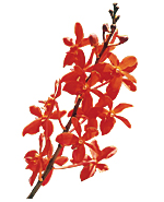
At the International Productivity Conference held in Singapore in October 2001, the Government of Singapore honored the APO on its 40th anniversary by naming a new hybrid orchid after the organization, the Stamariaara APO. It was specially selected for its resilience and flowering ability, much like the organization it was named after.
An orange-red hybrid, a shade close to the APO’s corporate color, the Stamariaara APO is a short bloomer, hardy, free-flowering all year round, easy to grow, and with uniform flowers each measuring 5.6 cm across. The name Stamariaara APO was registered with the International Registration Authority for Orchid Hybrids of the Royal Horticultural Society of England.